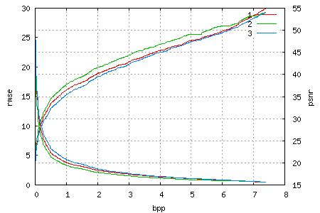
I’ve invested a bit of time in getting some nice rate-distortion graphs out of my wavelet image compression library. Now that it’s embedded, the process is fairly easy: Compress once into a single file and then decompress only enough bits from the file until the desired rate is achieved. As such, the graph also shows the quality over the progress of the file.
Here is an example of one such graph, for a 708×1024 image of Mena Suvari (which unfortunately comes from a JPEG source and thus has block noise), as the Lena image (notice the name similarity? ;)) is past its prime IMO, especially the color version has plenty of noise in the blue channel. The image was encoded in the YCoCg colour-space, which explains the slightly higher quality of the green channel and why even the highest rate is not lossless. Compared to the RGB version, the YCoCg representation incurs a mean-square error of ~0.25 (which results in the root mean-square error of 0.5 shown).

In theory, the rate/distortion graph should have a negative, but monotonically increasing derivative (which in normal language means something like “bigger improvements are closer to the beginning of the file”). We try achieve this by scheduling data units (which are essentially bitplanes of blocks) by how much they reduce the error in the coded image for each bit of their size. There are two reasons for this “close-but-not-quite-monotonically-increasing-slope”. One is that the error (distortion) is not computed exactly; instead I use an approximiation that based on the wavelet transform used. The other is the fact that we deal with packets / data units / blocks of finite size, and as soon as more than one channel is written to a single file, it becomes evident that a single packet will only improve a single channel – which in turn means the other channels have a stagnating improvement (zero derivative) for the size (or duration) of that packet.
These plots also make it easier to spot differences (usually either improvements or regressions) for changes in the code, so I’ve created graphs for all my test images, so that I can make these comparisons more easily in the future.
I’ve also taken an old pre-3.1 version (thank you, darcs!) that still used the recursive quantizer selection to produce similar plots (taking much longer as the image had to be compressed anew for each rate) and the result was pretty much a draw, in spite of the embedded version having to store a bit more sideband data (number of bitplanes for each block in the header, and which block is coded next in the bitstream itself). All of which makes the embedded version the “better choice”, due to its other advantages such as simpler code and “compress once, decompress at any rate”.
